
Really? Chartreuse is a great color for a highway sign, but not for a desktop that's supposed to blend into the background. It screams "Fisher Price" even louder than Luna does.d0g wrote:So far only the logo on the AVAnto's work looks good. Rest of the contributions is very poor. Try harder guys.
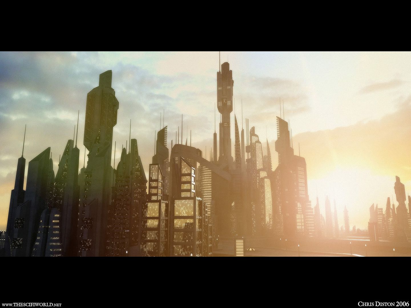
Anyway, I think slapping the ROS logo on random photographs is the wrong direction. We want something that's neutral and undistracting, yet not too bland. It should be nice if you directly look at, but it should also be easily ignorable if you have other windows over it. Any form of text or faces should be avoided (since we tend to look at text and faces in front of us, and I for one wouldn't enjoy reading "ReactOS" all day as my default). Something like this is a good start, though it has its own problems.
![[ external image ]](http://farm4.static.flickr.com/3647/3345368562_b0d6bb3c45_m.jpg)
![[ external image ]](http://img94.imageshack.us/img94/1005/reactosappdevcustom.png)
![[ external image ]](http://www.reactos.org/forum/styles/roscms/imageset/en/icon_post_edit.gif)
![[ external image ]](http://reactos.files.wordpress.com/2009/07/reactostesterusertranslator.gif)