
http://johnwedd.deviantart.com/art/reac ... -107597730
http://johnwedd.deviantart.com/art/reac ... -107597515
theres a couple of others, but those are the better ones.
my take on the ReactOS Logo
Moderator: Moderator Team
Re: my take on the ReactOS Logo
A Logo Should:
1. Match whatever it represents.
2. Look good at any scale/level of detail.
3. Be just as effective in black and white.
4. Use as few colors as possible (ties in with the above).
5. Match with anything it's placed with.
Your logo is nice, but it doesn't really fit any of those. I can't really look at it without thinking "Lololol blue ballz"
Is that what you want to be everyone's first impression of ROS?
Re: my take on the ReactOS Logo
Looks fairly cool to me but I do think the blue balls are over-emphasized. they should be smaller and not as bright as to increase the focus on the point of the reaction(where maybe a slightly more colorful effect could be used though the current seems like a good start). Also I agree with Aape that the level of detail could be a problem. I had a hard enough time just making one atom fit in a 16X16 while keeping it's features noticeable and not looking like a dot on my screen(my screen resolution is 1440X900).
Re: my take on the ReactOS Logo
Interestingly, the official ReactOS breaks many of these rules.Aape wrote:A Logo Should:
1. Match whatever it represents.
2. Look good at any scale/level of detail.
3. Be just as effective in black and white.
4. Use as few colors as possible (ties in with the above).
5. Match with anything it's placed with.
Your logo is nice, but it doesn't really fit any of those. I can't really look at it without thinking "Lololol blue ballz"
Is that what you want to be everyone's first impression of ROS?
[ Web | kevinski.com ] [ Wii | 7030 8283 2535 8378 ]
Re: my take on the ReactOS Logo
And this surprises you, why?kevinski wrote:Interestingly, the official ReactOS breaks many of these rules.
Re: my take on the ReactOS Logo
I know. I hate the official one too.kevinski wrote:Interestingly, the official ReactOS breaks many of these rules.Aape wrote:A Logo Should:
1. Match whatever it represents.
2. Look good at any scale/level of detail.
3. Be just as effective in black and white.
4. Use as few colors as possible (ties in with the above).
5. Match with anything it's placed with.
Your logo is nice, but it doesn't really fit any of those. I can't really look at it without thinking "Lololol blue ballz"
Is that what you want to be everyone's first impression of ROS?
Re: my take on the ReactOS Logo
its hard to make an effective logo that works on all those conditions in the shape of a molecule/atom, with out resorting to cheap knock offs of bio-radiation hazzard............. WAIIIIIIT A SECOND!!!
*runs to Ps to play, cackling*
*runs to Ps to play, cackling*
Re: my take on the ReactOS Logo
...which is why I ask that you reconsider with my spider-from-the-orange-lagoon take on the logo. XD
[ external image ]
[ external image ]
![[ external image ]](http://www.kevinski.com/0000/attach/reactos/simplified-reactos-logo-sketch.png)
[ Web | kevinski.com ] [ Wii | 7030 8283 2535 8378 ]
Re: my take on the ReactOS Logo
Maybe I'm a bit biased, but I like this one the best:
http://ccc543.deviantart.com/art/ReactO ... -107288117
<.<
http://ccc543.deviantart.com/art/ReactO ... -107288117
<.<
Re: my take on the ReactOS Logo
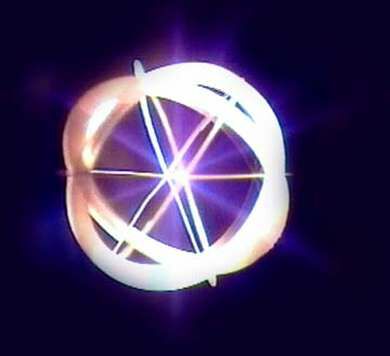
I've found the logo for nuclear fusion. If you don't know what nuclear fusion is, I suggest you do some research; it could be the answer to human kind's energy needs in the long term. Therefore it symbolizes hope, future and innovation. Perhaps that logo could be used as basis for ReactOS. I don't know where it came from or what copyrights it is under.
http://members.tm.net/lapointe/fusion_s ... ration.jpg
http://members.tm.net/lapointe/IEC_Fusion.html
http://members.tm.net/lapointe/fusion_s ... ration.jpg
http://members.tm.net/lapointe/IEC_Fusion.html
Re: my take on the ReactOS Logo
Nice logo, SdC… Better then the current one.
Re: my take on the ReactOS Logo
As desktop wallpapers, I like these.johnwedd wrote:http://johnwedd.deviantart.com/art/reac ... -107597730
http://johnwedd.deviantart.com/art/reac ... -107597515
theres a couple of others, but those are the better ones.
I like the actual logo itself as it is, but the modified version works well in these designs.
![[ external image ]](http://kevintrooper.m5t.de/ReactOSuser.png)
![[ external image ]](http://kevintrooper.m5t.de/ReactOSsupporter.png)
Re: my take on the ReactOS Logo
Also, in its present stage, it can't be run for longer than a few minutes/seconds before it destroys the walls of its reactor.SdC wrote:I've found the logo for nuclear fusion. If you don't know what nuclear fusion is, I suggest you do some research; it could be the answer to human kind's energy needs in the long term. Therefore it symbolizes hope, future and innovation. Perhaps that logo could be used as basis for ReactOS. I don't know where it came from or what copyrights it is under.
http://members.tm.net/lapointe/fusion_s ... ration.jpg
http://members.tm.net/lapointe/IEC_Fusion.html
Re: my take on the ReactOS Logo
Wow, that was a very smooth segue.SdC wrote:I've found the logo for nuclear fusion. If you don't know what nuclear fusion is, I suggest you do some research; it could be the answer to human kind's energy needs in the long term. Therefore it symbolizes hope, future and innovation. Perhaps that logo could be used as basis for ReactOS. I don't know where it came from or what copyrights it is under.
http://members.tm.net/lapointe/fusion_s ... ration.jpg
http://members.tm.net/lapointe/IEC_Fusion.html
Also, in its present stage, it can't be run for longer than a few minutes/seconds before it destroys the walls of its reactor.
Who is online
Users browsing this forum: No registered users and 8 guests